Select panel
Select panel is a semantic dialog that allows for complex selection options within an overlay.
On this page
On this page
Overview
Select panel is used for overlay containers that contain multiple control sets which includes advanced single or multi-selection with a filter. Select panel can be anchored to a trigger, or centered within a view.
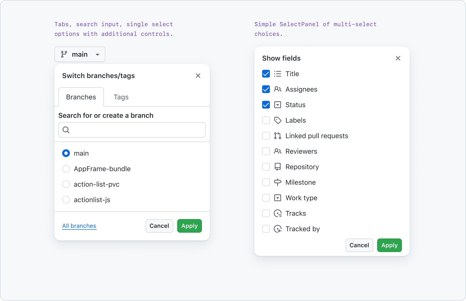
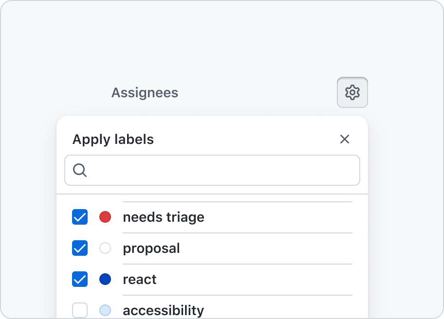
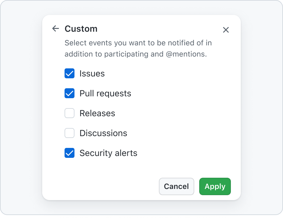
Commonly, select panel is used for metadata application to an Issue or Pull Request, like assignee and label selections, or the branch selector on a repository’s code tab.
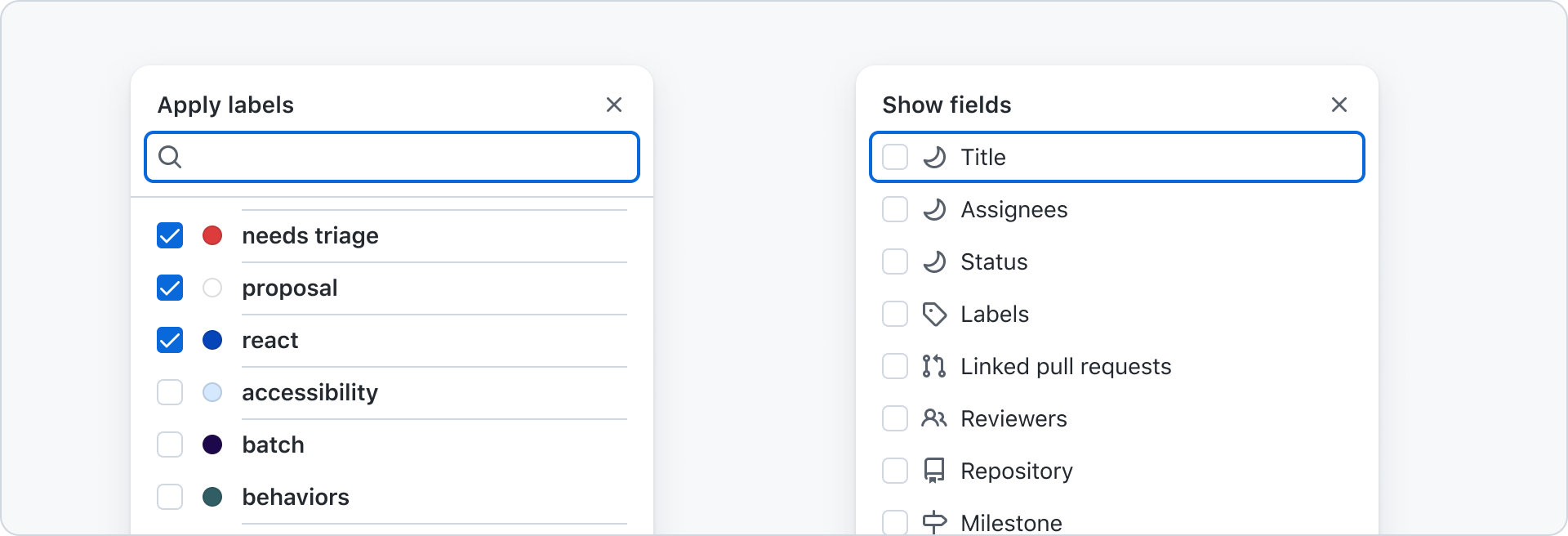
Anatomy
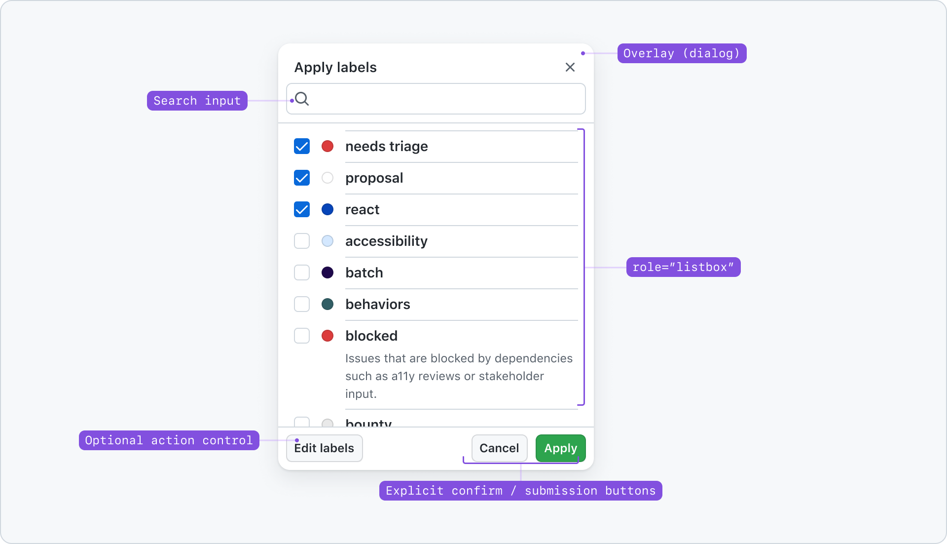
Options
Select panel can have as much as the branch selector component, or as little as just a multi-selection list. If the contents request user input beyond a semantic menu(example: the context menu on comments in GitHub), it’s likely you need a select panel.
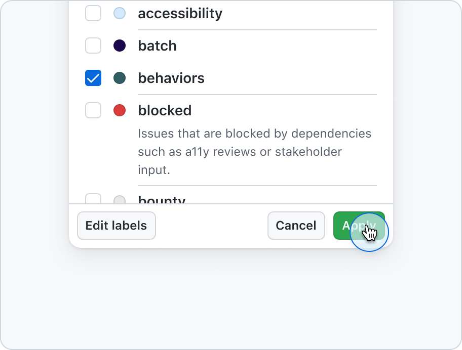
Additional control slot
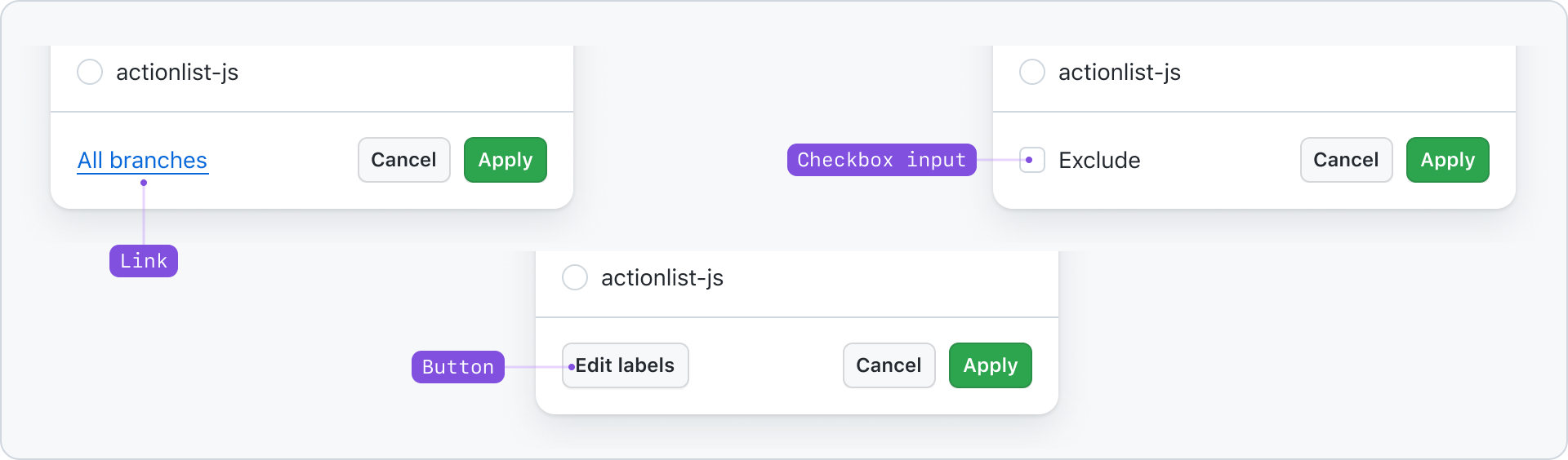
An optional control slot is available in the select panel’s bottom left corner. Avoid use if not absolutely necessary in order to avoid component and decision overwhelm.
Anchoring
Select panel should be anchored to its trigger.
Anchored select panel to a trigger.
Best practices
Be predictable
If there are more than single options in a menu, have a user confirm their choices.
Never force users to submit their multi-select options by closing the dialog or auto-updating their choices upon selection.
Click-to-dismiss behavior
Guide users to save or cancel their selections to dismiss select panel to prevent confusion and data loss.
Don’t allow a click-outside-to-dismiss behavior for select panel. Users may be used to closing and submitting the information. Doing so would result in a loss of their changes.
Behavior
Opening
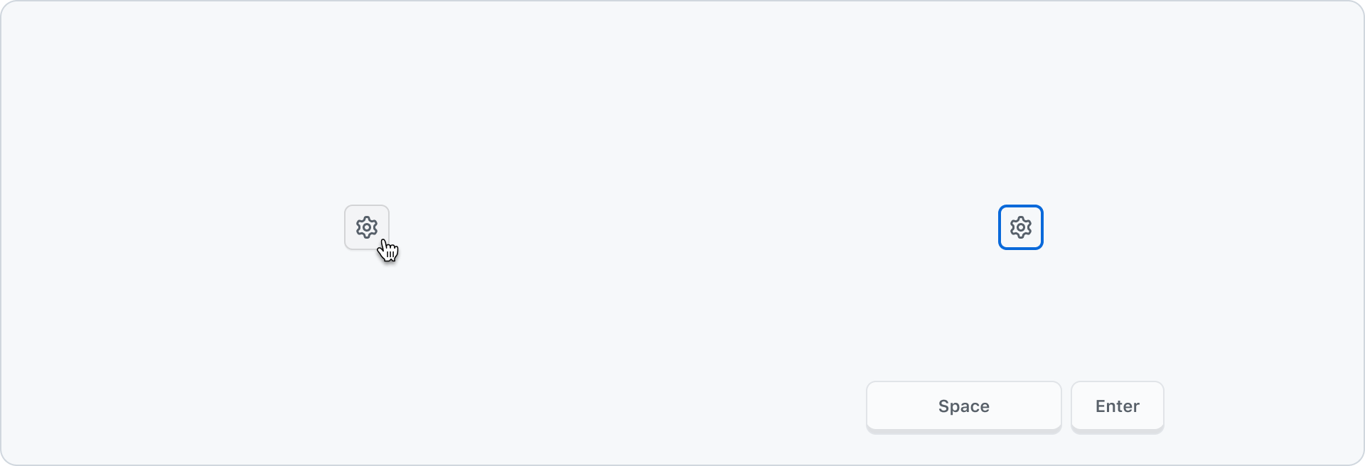
A select panel trigger should be a semantic button. Mouse users can click and keyboard users can open with space or enter.
Focus should be placed on the first interactive item within select panel.
Closing
Pressing esc, or selecting “cancel” should close the current dialog and enter focus to the previous trigger. It should not retain or submit any user input.
Selecting the submit button or pressing the enter key while focused in the listbox should submit any user input.
Responsive
Select panel can become a full screen dialog or a bottom sheet at narrow viewports. Support at 320px is required if the select panel is larger at wider viewports. See narrow-viewport placement in the Dialog guidelines for more details.
Keyboard navigation
Trigger
| Key | Description |
|---|---|
| Enter | Opens the select panel. |
| Space | Opens the select panel. |
Select panel
| Key | Description |
|---|---|
| Enter | Submits the information in the form when focused in the listbox. Activates buttons or links focused within the select panel. Does no action when focused in the search input. |
| Tab | Move focus forward between interactive controls and widgets within the dialog. |
| Shift + Tab | Move focus backward between interactive controls and widgets within the dialog. |
| ArrowDown | Move focus from the input to the listbox. (Shift+Tab required to move from listbox to input. Navigate forward through items in the listbox. If focus is on the last item in the listbox, ArrowDown does nothing. |
| ArrowUp | Navigate backward through items in the listbox. If at the first item in the listbox, ArrowUp does nothing. |
| Home | Move focus to first item in listbox. |
| PageUp | Move focus to first item in listbox. |
| End | Move focus to last item in listbox. |
| PageDown | Move focus to last item in listbox. |
| Esc | Close dialog and clear any changed inputs. |
Multi-select
| Key | Description |
|---|---|
| ArrowDown | Navigate through the listbox items. |
| Space | Select an item in the listbox. |
Single-select
| Key | Description |
|---|---|
| ArrowDown | Navigate through listbox items. Selection follows focus. |
Example behavior
Keyboard interaction with a single-select select panel demonstrating selection following focus with navigation via the ArrowDown key.